A student-led creative practice exploring branding, campaign design, and web visuals through bold typography, structured systems, and analog-digital contrast.
01 TYPE
02 GRID
03 TEXTURE
04 SYSTEM
05 SIGNAL
A curated selection of work built on bold visuals, clear structure, and modern design thinking.
Additional campaign and brand explorations built across multiple formats, audiences, and visual systems.
Starbucks Holiday Campaign
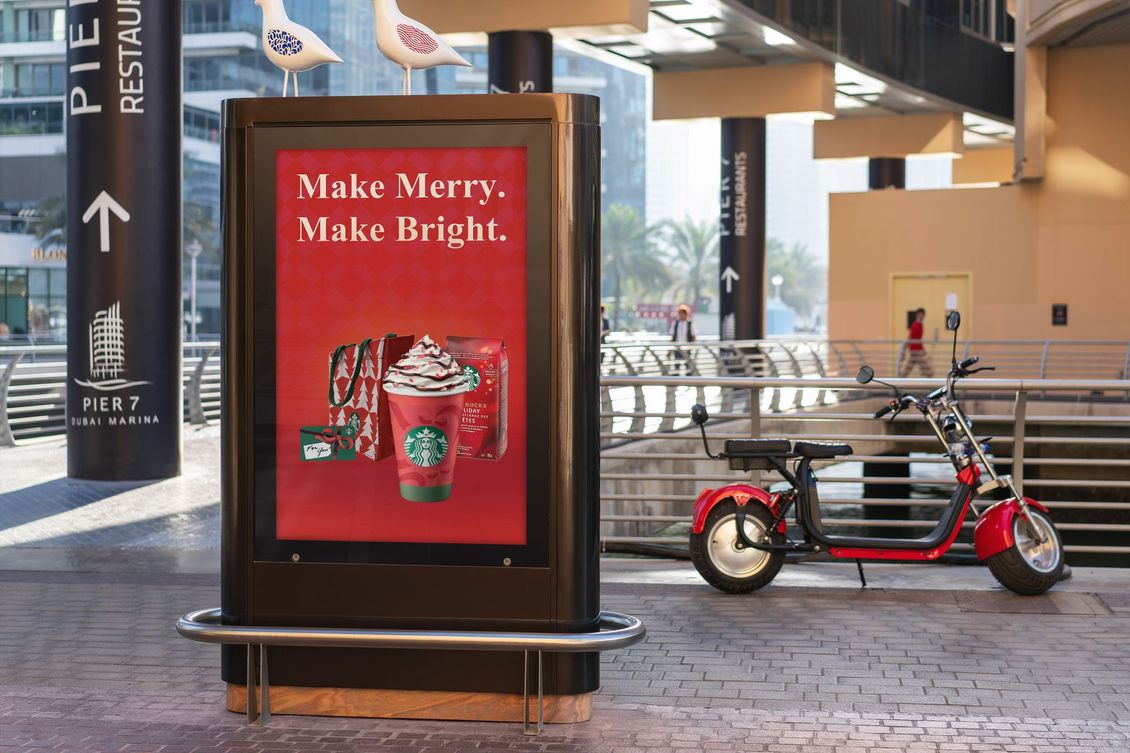
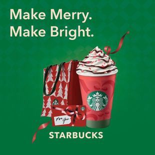
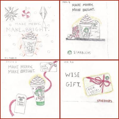
A seasonal campaign system exploring festive color, product-focused imagery, and consistent messaging across OOH, web, social, and retail touch points.
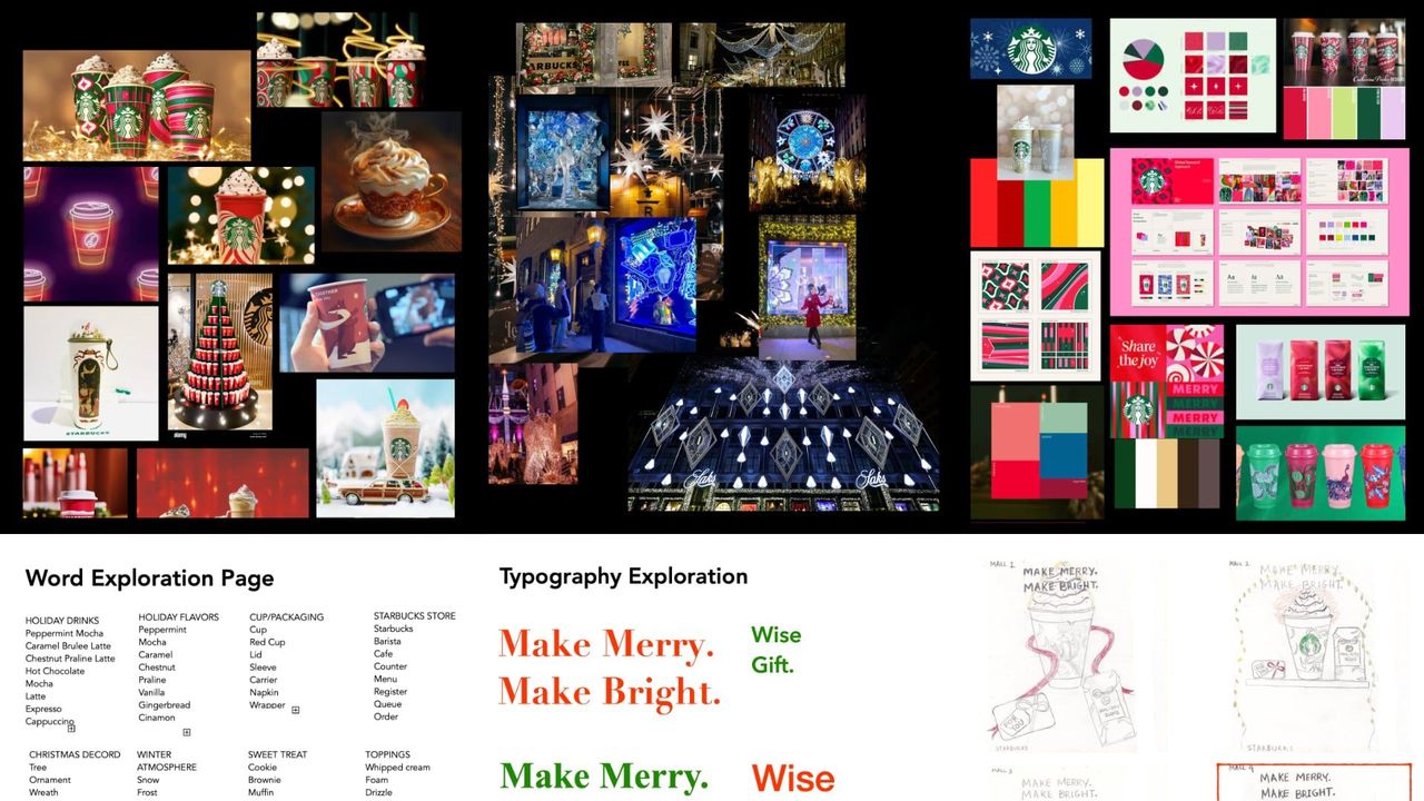
I start by studying the audience, context, competitors, references, and constraints. The goal is to identify the design needs to communicate before deciding how it should look.
Research the Signal
Research Output
AUDIENCE
Holiday Shopper.
BRAND CUES
Warmth, ritual, recognition.
DESIGN NEED
Festive system with strong Starbucks recognition.
OUTCOME
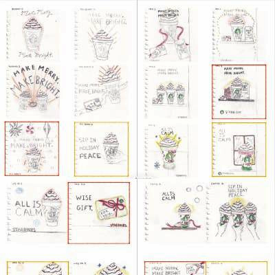
Moodboard, word lists, sketches, type exploration.
I turn research into visual possibilities through sketches, mood variations, typography tests, layout studies, and early campaign ideas. This step is about exploring multiple directions before refining the strongest one.
I define visual rules that make the concept repeatable: color, typography, layout, image treatment, and graphic motifs. This creates a flexible system that can adapt across formats while still feeling like one campaign.